Figure 1.

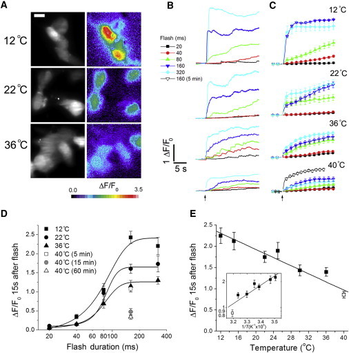
Temperature dependence of global Ca2+ signals. (A) Images of Ca2+ signals evoked by a 160 ms UV photolysis flash in SH-SY5Y cells at 12°C, 22°C, and 36°C. The grayscale images on the left show resting fluorescence to indicate the outlines of the cells. The color images on the right show single 15 ms exposures captured 15 s after the flash, depicting ΔF/F0 fluorescence ratios on a pseudo-color scale as indicated by the color bar, with warmer colors representing higher [Ca2+]i. (B) Representative fluorescence traces showing responses in cells evoked by photolysis flashes (arrow) of 20, 40, 80, 160, and 320 ms durations at temperatures of 12°C, 22°C, 36°C, and 40°C. Each trace shows the average fluorescence throughout the majority of a single cell, excluding the nucleus. Fluorescence is expressed as a ratio of fluorescence change (ΔF) relative to resting fluorescence (F0) before stimulation. Cells were incubated at each temperature for ≥15 min before the flash. (C) Mean responses from ≥10 cells in response to different photolysis flash durations as indicated. The 40°C plot depicts mean responses from cells held at this temperature for ∼5 min (open symbols) or 15 min (solid symbols) before recording. For the 5 min incubation at 40°C, only the response to the 160 ms flash is shown. (D) Plot of mean peak calcium signals (ΔF/F0) at different temperatures as a function of flash duration (logarithmic scale). Measurements were taken 15 s after the photolysis flash. The solid symbols plot the responses of cells that were maintained at the indicated temperatures for at least 15 min before the flash. The open symbols indicate the response of cells held at 40°C for 5 (square) or 60 min (triangle) before a 160 ms flash. Curves are fitted sigmoidal dose-response relationships. (E) Pooled data plotting the mean responses to 160 and 320 ms UV flashes as a function of temperature. The 40°C data (open square) were obtained ≤5 min after warming to this temperature. (n = 96, 53, 86, 42, 54, 103, and 86 cells at temperatures of 12°C, 15°C, 22°C, 26°C, 30°C, 36°C, and 40°C, respectively). In this and subsequent graphs, the main plot is shown on linear scales and the inset shows an Arrhenius plot of the same data with a logarithmic y-axis and temperature scaled as reciprocal kelvin. Data in the Arrhenius plot are fit by a single regression line corresponding to Q10 = 0.73. The line in the main graph is a regression fit. Error bars in all panels indicate mean ± 1 SE.
