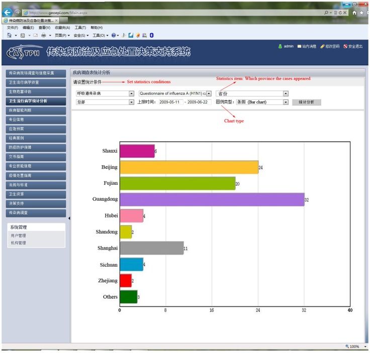
Figure 9. Bar chart of the distribution of influenza A (H1N1) cases in different provinces in early stage of the epidemic in the DSSRIDE.
Using the DSSRIDE, users could analyze the collected data in real time and display them in various ways; e.g., as a bar chart, pie chart, line chart, or thematic map.

