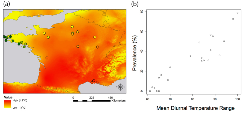
Figure 2.
(a) Map showing i) prevalence of Plasmodium at sampled locations (dots in warmer colors equal higher prevalence) overlayed on ii) a spatially continuous map of diurnal temperature range (the most important variable in our models, warmer colors indicate higher diurnal temperature ranges); (b) Correlation between the prevalence (percentage of infected individuals per site) and the mean diurnal temperature range (Celsius degree x10). Map created in ArcMap 10 (Environmental Systems Resource Institute, ArcMap 10.0 ESRI, Redlands, California).

