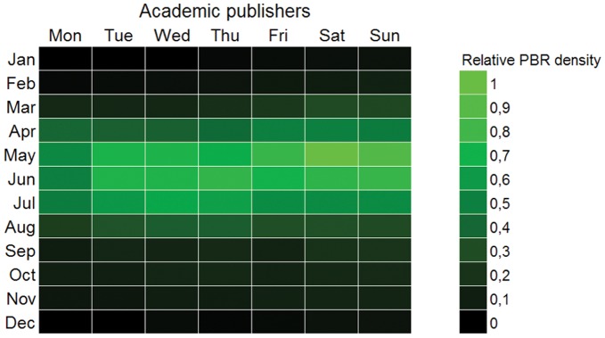
Figure 14. Hebdoplot of academic publishers.

Record density map for days of week and month for records published by academic institutions. Color scale is proportional to the binary log of records. Brighter color is more records. The pattern for these data, often collected by scientists, academicians or amateurs, is denser in and around the weekends and very seasonal for late spring-early summer.
