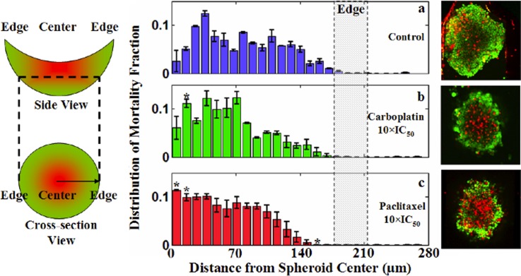
Figure 6.
Radial distribution of the mortality fraction. (Left) Graphical delineation of the image analysis scheme to determine the radial distribution of the mortality fraction. (Middle, panels (a)–(c)) Averaged mortality distribution function of image layers 10-13. (Right) Representative sample images corresponding to the quantitative results. For each sample, distribution function has been normalized (dead cells within a radius range/the number total dead cells) so that integration of it over the whole radial domain remains one. The symbol * in (b) and (c) represents a point for which an increase or decrease in the mortality fraction is statistically significant (p < 0.01) with respect to controls. Each data point is averaged over three independent experiments (with total number of samples, n = 16) and shown as mean ± standard deviation. Note that treatment with carboplatin and paclitaxel showed a more prominent rise in mortality fraction closer to the spheroid center than near the edges.

