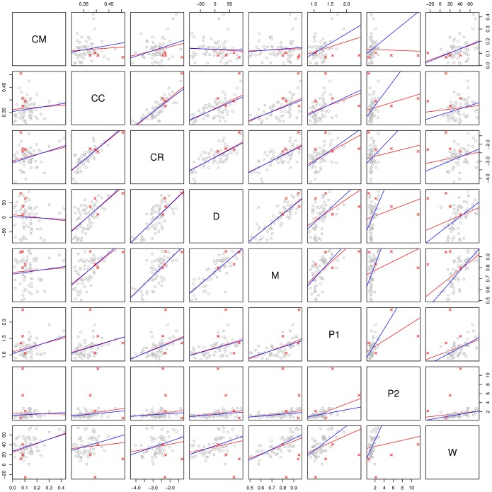
Figure 1. Relationship between different stability estimates.
Each panel shows the scatterplot of the stability estimates for the shared features produced by a pair of methods (grey dots) and the identified outliers (red crosses; see text for details). The regression lines with the outliers (red) and without (blue) have been drawn for convenience.

