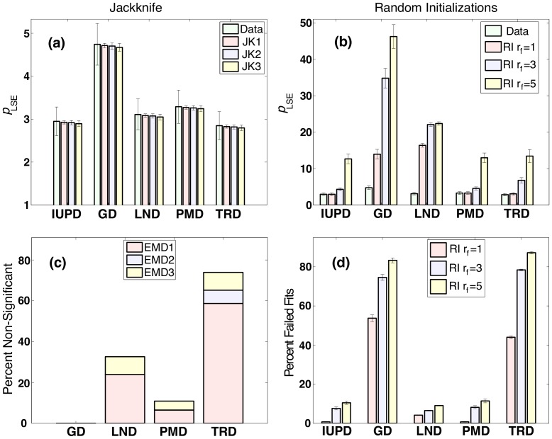
Figure 5. The left column shows the results obtained using jackknife, and the right column shows the results obtained using randomized initial conditions with the randomization factor .
 1, 3, and 5. In (a) the mean values of
  across 46 ADDs from figure 4 (labeled “Data”) are compared to the values obtained from 100 jackknife randomizations with varying numbers of points removed (JK1, JK2, and JK3). Error bars indicate SE for the original data, while for JK they are the estimates of such error. (b) Mean
  obtained from the “successful” fits among all RI replicates, and across all data sets, with SE reported across 46 data sets. (c) Percentage of ADDs, among 46, in which the IUBD
  failed to be declared significantly lower. Each bar is colored to indicate how the ADDs are divided among different data sets. (d) Percent of failed fits among
  RI replicates with mean and SE reported across the 46 ADDs. N.B. differences in y axis scaling in (a) and (b).

