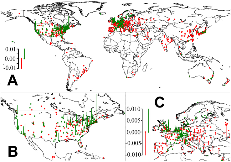
Figure 2. World map of the greatest knowledge sources and sinks, based on our scientific fitness index.
Green bars indicate that the number of citations received is over-proportional, red that the number of citations received is lower than expected (according to a homogeneous distribution of citations over all cities that have published more than 500 papers). It can be seen that most scientific activity occurs in the temperate zone. Moreover, areas of high fitness tend to be areas that are performing economically well (but the opposite does not hold).

