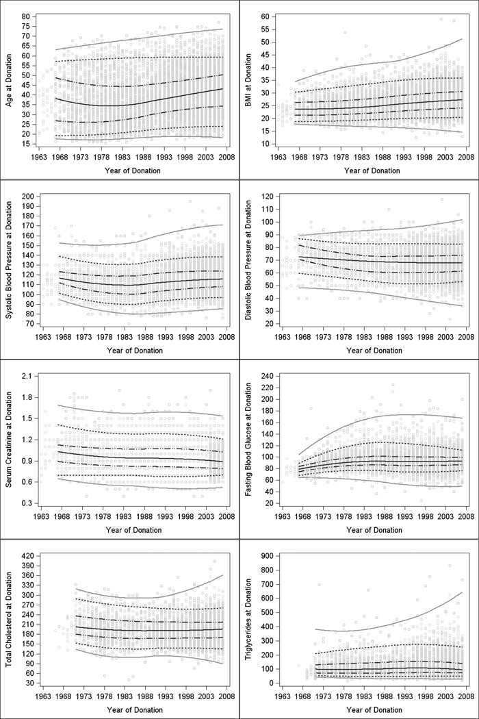
Figure 2. Characteristics of living donors by year of donation.
Plots of pre-donation characteristics by year of donation with smoothed trends (loess curves) over time for each quantile (5th, 25th, 50th, 75th, and 95th). Gray circles represent data points. The middle solid black line represents the median. The black dotted-dashed lines are the 25th and 75th percentiles. The black dotted lines are the 5th and 95th percentiles and the solid grey lines are smoothed through the minima and maxima. The slopes and significance of tests for linear trends are shown in Table 4.

