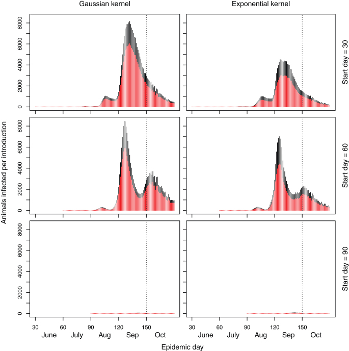
Figure 2. Stacked barplots of the number of sheep (red bars) and cattle (black bars) infected on each day of the simulated epidemic when the maximum temperature is used.
The broken line represents start of the period in which in-lamb ewes may be at risk of reproductive losses. Note the different scale compared to Figure 1.

