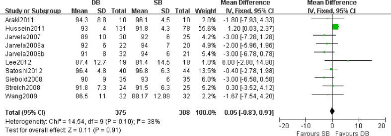
Fig. 2.
Forest plot of Lysholm score. Individual studies are listed on the left with Lysholm score (mean and standard deviation) as well as number of patients in each study group. A visual representation of the standard mean difference for each study is plotted on the right with a diamond. The large black diamond at the bottom represents the pooled treatment effect of all studies. It lies on the midline, representing no significant difference (P = 0.91) with a fixed effects model. DB double-bundle, SB single-bundle, Järvelä 2008a the study of reference [22], Järvelä 2008b the study of reference [24]

