. 2013 Jan 31;10:E13. doi: 10.5888/pcd10.120148

Figure.

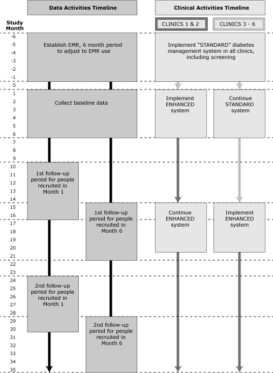
The figure uses a series of boxes to illustrate the timeline of the standard diabetes management system and the enhanced diabetes management system in terms of both their data activities and their clinical activities. Each box represents a step in the timeline for each management system and is positioned against a vertical axis that enumerates months of study. The data activities timeline appears on the left side of the figure, and the clinical activities timeline on the right side.

Data activities timeline and clinical activities timeline for standard diabetes management system and enhanced diabetes management system.