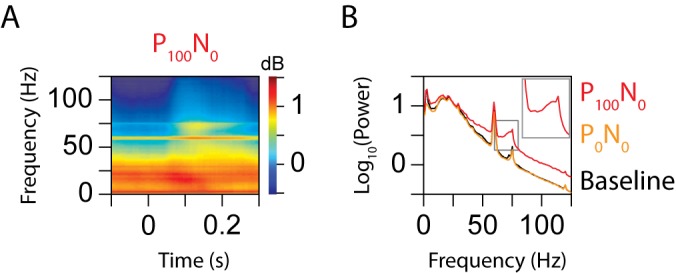
Figure 2. Time-frequency analysis.

(A) Average time-frequency power spectrum of 96 sites for the P100N0 condition. The sharp horizontal lines at 60 and 75 Hz reflect the increase in power due to the line noise and monitor refresh rate, respectively. (B) Left panel shows the average power spectrum (as a function of frequency) during the P100N0 stimulus condition, computed by averaging the time-frequency power shown in Figure 2A between 50 and 250 ms (red trace). Spectrum for the P0N0 condition (orange) and the prestimulus baseline condition (black) are also shown for comparison. The inset shows the red trace at 2× magnification to highlight the narrow peak due to the monitor refresh rate.
