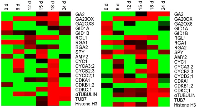
Figure 5. Heat map diagrams of gene expression detected by microarray analysis and RT-PCR analysis of interested genes.
Green indicates down-regulation and red indicates up-regulation of the gene for particular treatment. Each column represents a treatment of 0 d, 6 d, 12 d, 15 d, 18 d and 24 d chilling. Averages of replicates from MA (left), averages of RTPCR (right).

