
Figure 3. Ranking of nodes according to their mean out-component size 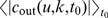 .
.

Each curve corresponds to one node. The top hundred nodes with the largest out-components are shown. Curves representing nodes with higher ranking are darker than those with lower rankings. For illustration purposes an arbitrarily chosen node is displayed in red.