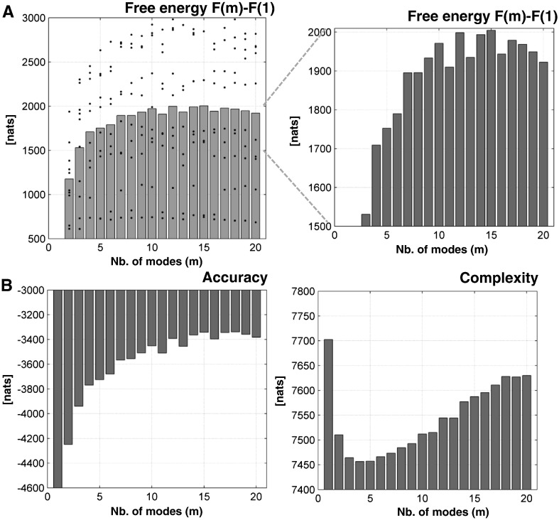
Fig. 3.
(A) plots the average free energy over our 10 subjects (that constitute a fixed-effect group model comparison) over the number of modes m—relative to the free energy at m = 1 (gray bar graph). The value of the free energy for each subject is shown as black dots. A zoom of the free energy (right bar graph) illustrates how the free energy (log evidence) initially increases with the number of modes and then decreases with larger numbers of modes. The winning model was at m = 15 with a difference in log evidence of 6, in relation to the next best model at m = 12. (B) illustrates the increase of the accuracy with the number of modes (left bar graph) but in the context of increasing model complexity (right bar graph). The complexity is just the difference between the free energy and accuracy.

