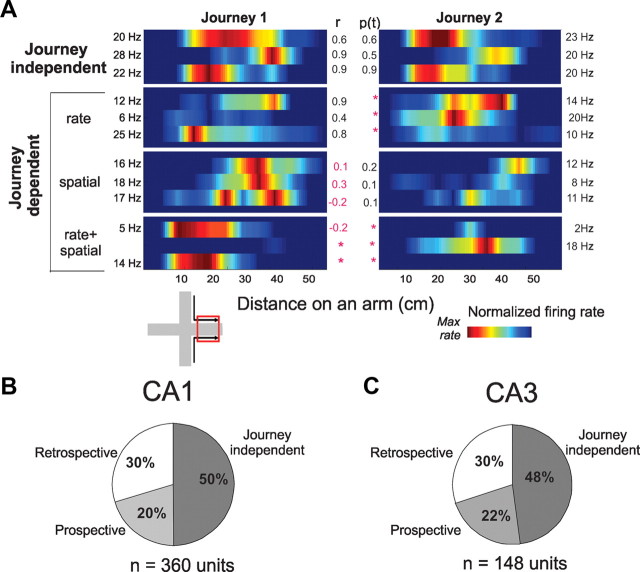
Figure 3.
Firing rate maps and journey-dependent activity during STD sessions. A, Color-coded firing rate maps compare examples of single unit activity across corresponding journeys (1 and 2, e.g., in the East arm, left inset). Each horizontal bar shows the mean firing rate of one cell along one arm during a STD session; adjacent bars show the same cell on the same arm during corresponding journeys. Rate maps, smoothed here but not in statistical analyses, show firing rates normalized to each cell's maximum in each journey (listed at the edge of each panel). Pearson's r (center left) and Student's t (p value, center right) compared the distributions across journeys, with significant differences shown in red. The top panel shows three cells with journey-independent place fields; the lower three panels show examples of nine cells with journey-dependent place fields that differed either by mean firing rate (second from top), spatial distribution (third panel from top), or both (bottom). The mean infield firing rate of journey-independent place fields (5.04 spikes/s) was higher then journey-dependent place fields (3.74 spikes/s; t(370) = 3.39, p < 0.001), as would be expected if firing during preferred journeys was similar to journey-independent place fields, and decreased during nonpreferred journeys. B, C, The pie charts show proportions of journey-independent and journey-dependent (prospective and retrospective) place fields in CA1 (B) and CA3 (C) during all STD sessions. The proportions were similar between CA1 and CA3.

