
Figure 1.
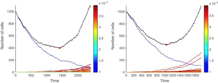
Example simulations of the model demonstrating tumor population trajectories during treatment. The black line indicates the size of the total tumor population, the blue line indicates the initial sensitive population. The multicolored lines represent the temporal dynamics of individual resistant clones created via mutation from the sensitive cell population,  is the sum of these populations. The color of each of these lines is dictated by the clonal fitness (mapped via the colorbar on the right), which is drawn at random from a symmetric beta (2,2) distribution on [0, 0.001]. The red circle in each plot marks the point at which the minimal tumor size is achieved.