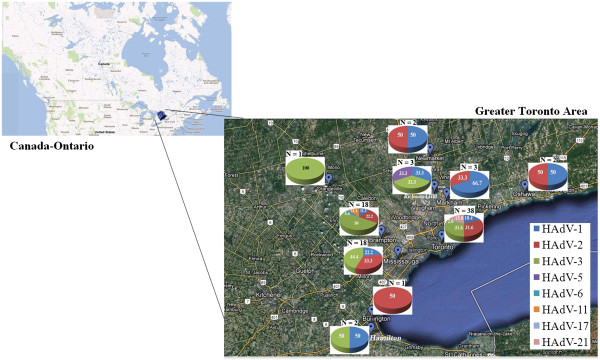
Figure 1.

Geographical distribution of human adenovirus serotypes causing respiratory infection in the Greater Toronto Area, Ontario, from December 2008 to April 2010. Pie charts represent the HAdV serotypes identified in each region, and their subsequent serotypic identities. The numbers within the pie charts are percentages from the total of each serotype. The “N” number above each chart represents the total number of samples that were found in that area.
