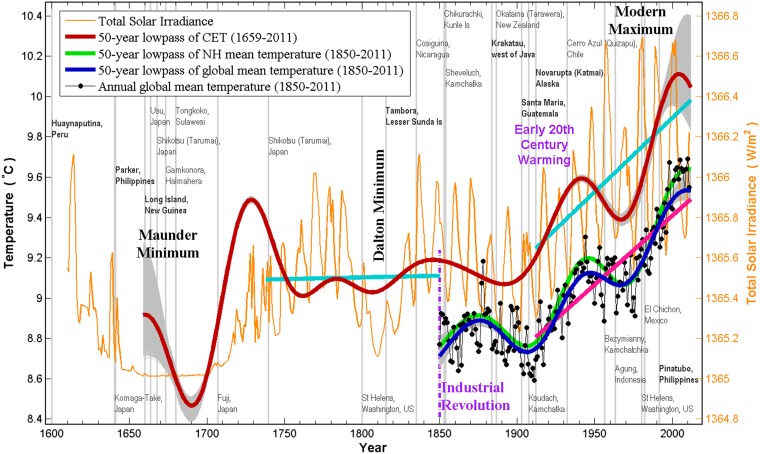
Fig. 2.
Four centuries of climate variation. The low-frequency portion of the monthly Central England Temperature, in red, is calculated using the 50-y low-passed filtered wavelet reconstruction. Similarly constructed global mean temperature is shown in blue and North Hemispheric mean in green, offset by the fact that HadCRUT4 data are relative to the 1960–1999 mean. The raw annual mean data are shown in the background for the global mean. Light-blue straight lines are least-squares fit to selected periods in CET. It shows that there is a century after 1750 with little trend and that the recent 100-y trends in the CET and global mean (pink straight line) are approximately the same. The thin gray curves are from 3,000 synthetic time series, which have 214 −1 mo added to each side of the same 1659–2011 information. The gray band quantifies the errors due to the cone of influence (edge effects). TSI (scale on the right axis), courtesy of Judith Lean, is shown in orange. Years of large volcano eruptions [with a Volcano Explosivity Index (VEI) of 5 and higher] are indicated by light-gray vertical lines. Boldface type is used for the names of major volcano eruptions with a VEI of 6 and 7.

