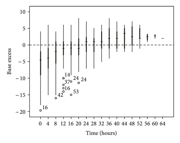
Figure 5.

Base excess changes over time during citrate CRRT. Standard box plot in which the horizontal line represents the median, the thick line represents the interquartile range, and the thin line represents the maximum and minimum values. The circular dots represent the outliers.
