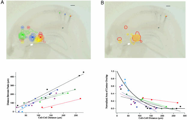
Fig. 5.
(A) Distance between the location of the most prominent peaks of the CA3 input source regions for CA1 neurons plotted vs. intercellular distance in CA1 for each cell pair (see Methods). Neuronal pairs recorded from the same slice are shown in the same color. The best-fit lines for each slice data set are also included to show the trends. (B) Normalized area of contour overlap in the CA3 response profiles plotted versus intercellular distance in CA1 for each cell pair (see Methods). Neuronal pairs recorded from the same slice are shown in the same color. The best-fit lines for each slice data set are also included to show the trend. The thick black line represents the same overlap measure for two circles of diameter 200 μm as a function of the distance between their centers. (Scale bar, 100 μm.)

