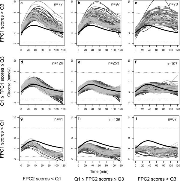
Figure 3.
Individual curves. The figure shows the 974 individual, fitted curves classified according to the lower (Q1) and upper (Q3) quartiles of the FPC1 and FPC2 scores. The bold black curve is the overall mean of the fitted curves. Higher panels indicate higher FPC1 scores, and panels to the right represent higher FPC2 scores. The magnitudes of the FPC3 scores are represented using shades of grey: the lighter shades indicate higher FPC3 scores. The lower dashed line is 2.5 mmol/l, one possible cut-off for hypoglycaemia [32], and the upper dashed line is the diagnostic threshold for gestational diabetes, i.e. a 2-h value of 7.8 mmol/l [1]. The three women diagnosed with gestational diabetes are outlined with bold, grey lines in Figure 3c.

