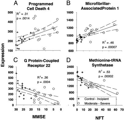
Fig. 2.
Examples of correlated genes illustrating the four directions of correlation through which genes were identified. For each gene, expression intensity is plotted on the y axis, and MMSE (A Left and C Left) or NFT (B Right and D Right) scores are plotted on the x axis; R2 value, P value (Pearson's test), linear fit (black line), and 95% confidence intervals (dashed lines) are also shown. The MMSE scale is reversed, so that more advanced AD increases to the right on both indexes. (A and B) Genes for which expression levels were up-regulated with AD, identified by negative or positive correlation with MMSE (A) or NFT (B) scores, respectively. (C and D) Genes for which expression levels were down-regulated with AD, identified by positive or negative correlation with MMSE (C) or NFT (D), respectively.

