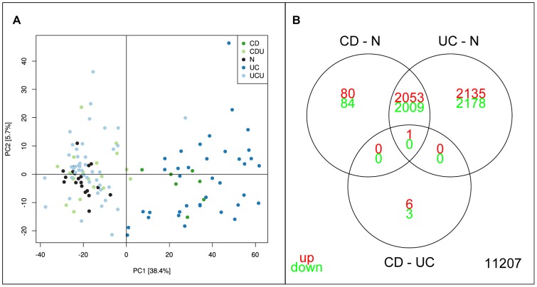
Figure 1. Initial analysis of NTNU data set.
A: PCA analysis of NTNU data set. Each point represents one sample, with colour indicating sample groups as described in figure legend. Axis indicate % of total variance explained in each component. B: Venn diagram illustrating the relationship between analyses of sample groups UC and CD directly and using N as common reference. Numbers indicate significant genes (corrected p-val<0.05).

