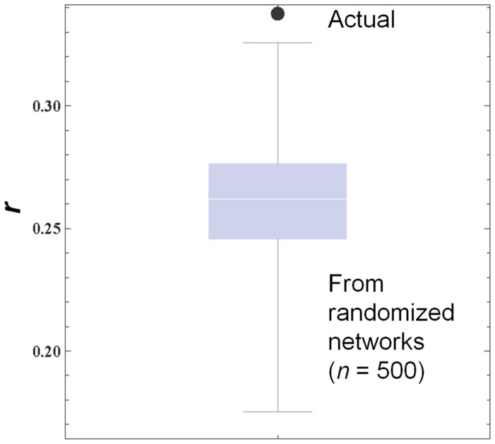
Figure 3. Comparison of Pearson’s correlation coefficients (r) between actual and simulated cases.
A large dot shows the actual correlation coefficient observed in Figure 2, while the box-whisker plot shows the distribution of simulated correlation coefficients calculated on randomized network topologies in which the out-degrees of individual nodes were all fixed.

