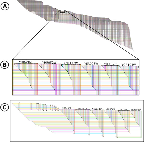
Figure 1.
BioFabric network display. This is a depiction of the yeastHighQuality.sif data set [3-5] containing over 3000 nodes and 6,800 edges. The key feature of the BioFabric presentation is that nodes are depicted as horizontal lines, one per row; edges are presented as vertical lines, each arranged in a unique column. Note how the use of darker colors for rendering edges and lighter colors for rendering nodes insures that the former stand out despite the crossover. A) The view of the full network, laid out with the default algorithm. B) Detail of network shown boxed in network A, which highlights one advantage of the BioFabric presentation technique: similarities, and differences, in the connectivity of different nodes are immediately apparent. C) The six nodes and first neighbors depicted in a subset view, where all extra space has been squeezed out, creating a compact presentation that still retains all the relative positioning from the full view. Note how the full inventory of edges incident on the six nodes also includes those on the left originating from higher node rows.

