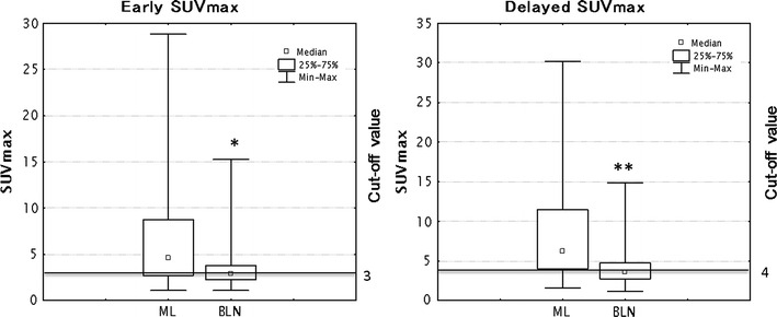
Fig. 2.

Box and whiskers plots showing distribution of early and delayed SUVmax among ML and BLN. The graph showed the distribution of data based on the five number summary: minimum, first quartile, median, third quartile, and maximum (*P < 0.01, compared with early SUVmax in ML, **P < 0.01, compared with delayed SUVmax in ML)
