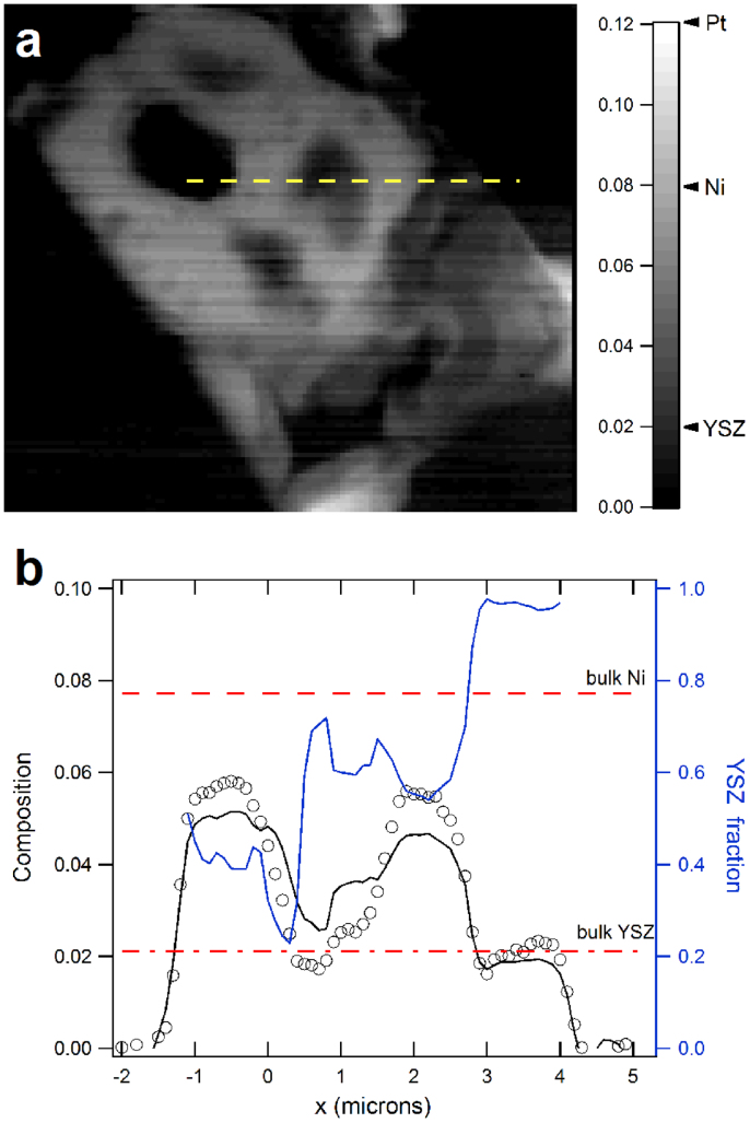
Figure 4.
(a) is the composition map displays the variation of the β/δ ratio.The bright region correlates well to the Pt- and Ni-rich areas. The darker region in the bottom-right quadrant is mostly occupied by YSZ. A line plot across the yellow line is shown in (b) (black circle). The two red dashed lines correspond to the β/δ ratio for pure Ni (upper) and YSZ (lower) phases. The black solid curve is the β/δ ratio calculated from the Ni fluorescence data (see text for explanation). The two curves agree reasonably well, showing the consistency of the data. The blue line in (b) is the YSZ mole fraction extracted from the measurement.

