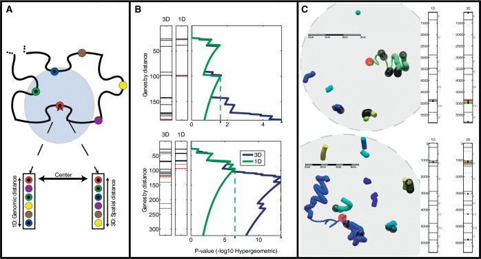
Figure 2.
Comparing functional enrichment between the genomic and spatial regions of the genome. (A) Two genomic distances. The schematic shows the gene neighborhood surrounding a particular gene (red). The neighboring genes may be ranked by their genomic proximity (left) or their spatial proximity (right). (B) Detecting areas of enrichment for TF-cohorts. In ranked gene lists, generated by either genomic or spatial proximity, the genes annotated as targets of a particular TF are indicated as black lines. The P-value of the enrichment of the targets for each threshold is indicated on the right. The threshold with the best P-value is indicated by the dashed line (see ‘Materials and Methods’ section). This analysis is shown for two genomic loci surrounding both YHL050C and YHL050W-A (top) and YCL012C (bottom) genes respectively, and querying for targets of GLN3. (C) Local structures of the two loci examined in B. Colors indicate distinct yeast chromosomes. The red circles indicate the center gene around which co-localization was tested. The content shown in each sphere is the environment that corresponds to the mHG threshold, dictated by the most enriched spatial environment for GLN3 targets. Bars on the right mark the loci along the linear genome, which participate in the most enriched environment by both the genomic and spatial rankings. Black dots, both in the bars and the visualized structure, indicate gene targets of GLN3. Scale bars were calculated according to an average size estimate for 1 kb of chromatin  0.33 µm. Chromosomes are colored as indicated in the legend.

