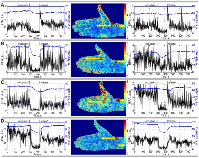
Figure 5. Time traces of the BPA (black curves) and the mean intensity of the back-reflected light (blue curves) calculated for four subjects by data averaging within selected ROI of 8×8 pixels.
We placed the ROI in the ‘hot’ spots of 2D maps of the blood pulsation amplitude which are shown in the middle of each row. Yellow arrows indicate the ROI positions (which are shown in the BPA maps with the black squares) within which the respective graphs were calculated. Moments of blood vessels occlusion and its release are shown in every graph by red arrows.

