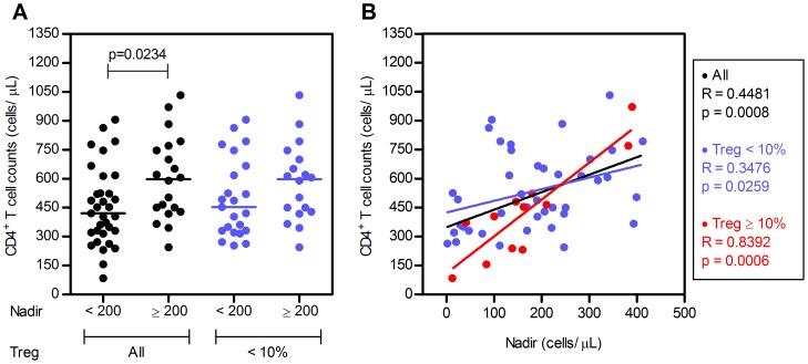
Figure 3. Individuals with high Tregs percentages feature the strongest correlation between CD4+ counts and Nadir values.
A. HIV+ individuals were subdivided according to their Nadir counts (<200 and ≥200 cells/µL) and grouped according to Tregs percentages (all individuals and individuals with <10% Tregs) and the CD4+ T cell counts are shown for each group. Each dot represents a single individual and the line the median value for each group. P-value for the comparison of the CD4+ T cell counts is indicated (Mann-Whitney test). B. Scatter plots illustrating the correlation between Nadir value and CD4+ T cell counts during HAART. Each dot represents a single individual. P-value for the correlation between CD4+ T cell counts and the Nadir value is shown (Spearman's correlation).

