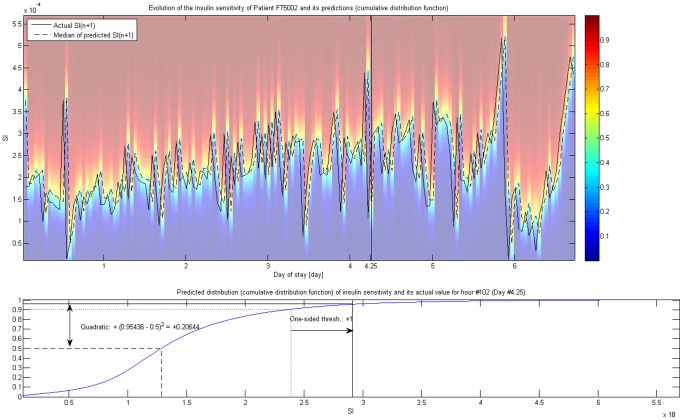
Figure 1.
 variability and its metrics.
Illustration of the evolution of  for a given patient (FT5002). Background colors represent the cumulative distribution function of the prediction for
  based on
  using the whole cohort; its 25th, 50th (i.e. median) and 75th percentile is explicitly shown. Lower part of the Figure highlights the calculation of the two metrics using Hour #102 (Day #4.25, marked on the upper part) as an example.

