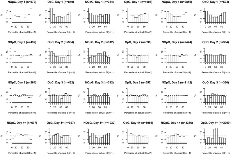
Figure 3. Distribution of predictions according to diagnosis and day of stay.
Histograms of the percentile of actual  values on their predicted distribution grouped according to day (rows) and diagnosis group (columns). Dashed line indicates the ideal (uniform) case of perfect prediction. The number of hourly measurements which was used to construct the histogram is shown in the title.

