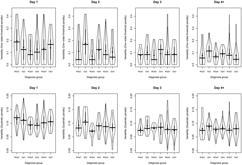
Figure 4. Distribution of per-patient variability scores according to diagnosis and day of stay.
Violin plots of per-patient overall variability scores segregated according to day and diagnosis group. Upper row shows one-sided threshold penalty metric, while lower row shows the quadratic penalty metric. Thick vertical lines indicate the interquartile range, the crossing horizontal line is at the median. Dots indicate the mean.

