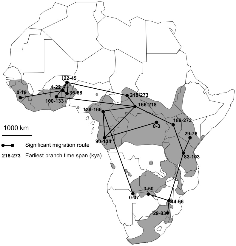
Figure 4. Map of the African continent showing the seventeen historical migration rates between sampled localities supported by a Bayes factor >3.
Grey shape on the map represent the actual distribution of the African buffalo after IUCN’s Antelope Specialist Group, 2008. Numbers on the map indicate the median time endpoints over all BEAST trees of the earliest branch with a given locality state. Hence, it provides an estimate of the earliest migration into each locality.

