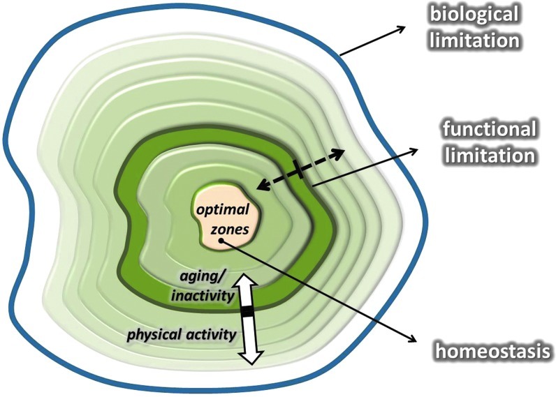
FIG. 3.
This figure shows the hypothetical adaptive range. The middle of the graph represents the optimal zone of the dynamic homeostasis, while the outer line indicates the biological limitations, which cannot be reached without extreme risk of death. The line, called functional limitation, shows the capacity of each individual, and it is a mobile value. The functional/actual limit can be readily altered by exercise training. Aging decreases the rate of adaptive response, and the capacity to maintain homeostasis is decreasing, as demonstrated by the white arrows. Dotted arrows indicate the flexibility of functional limitation. (To see this illustration in color, the reader is referred to the web version of this article at www.liebertpub.com/ars.)

