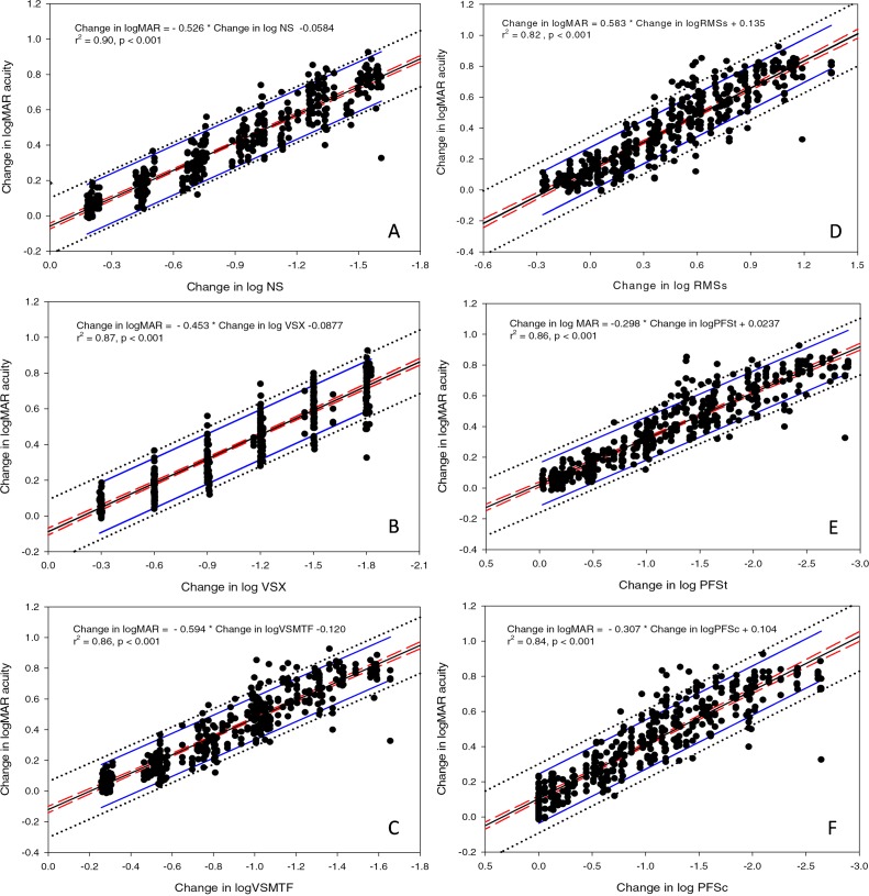
Figure 3.
Panels A through F plot change in acuity as a function of change in six image quality metrics. The central black line represents the best-fitting regression line, red dashed lines represent the 95% CI for the regression, blue lines represent the 95% CI from the regression line for clinically significant change in acuity as defined by Arditi and Cagenello (1993), and the black dotted line represents the 95% CI defined by the data.

