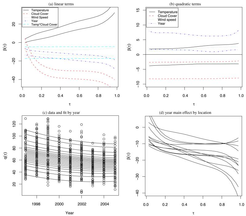
Figure 3.
Results for Atlanta substudy. Panels (a)–(c) plot the results for one location. Panels (a) and (b) give posterior 95% intervals for main effect and second-order quantile curves. Panel (c) plots the data by year, along with the posterior mean quantile curves for several quantile levels ranging from τ = 0.05 to τ = 0.95 with all covariates fixed at 0.5 expect year. Panel (d) plots the posterior mean of the year main effect for each location. The online version of this figure is in color.

