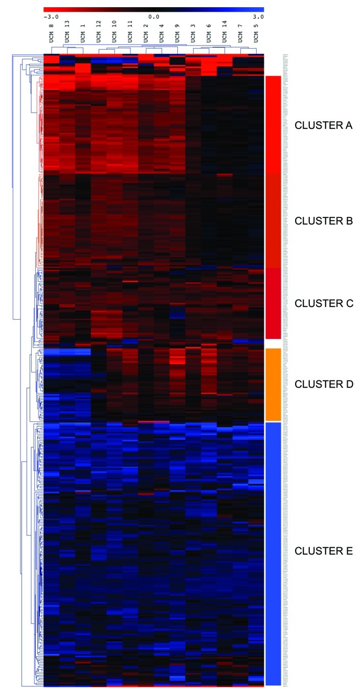
Figure 3.
Heatmap of the methylation alterations detected by the MS-AFLP arrays. Only alterations detected in two or more of the UC samples are included in the figure. Red indicates hypermethylation (log2 ratio < −1) and blue indicates hypomethylation (log2 ratio > 1). Every column corresponds to a different sample, and every row corresponds to a different MS-AFLP array spot. Cases and spots were clustered according to the Euclidean distance using MeV. The analysis revealed 5 main spot clusters (A–E). Samples were classified in three main groups based on the methylation status of the clusters A, B and D. For more information about the genes in each cluster, see the main text.

