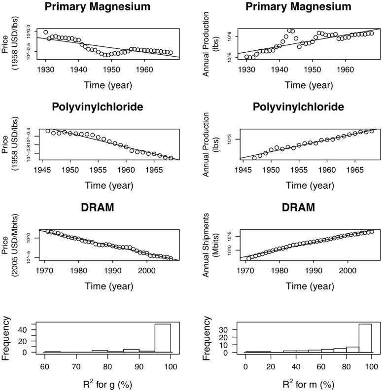
Figure 3. Three examples showing the logarithm of price as a function of time in the left column and the logarithm of production as a function of time in the right column, based on industry-wide data.
We have chosen these examples to be representative: The top row contains an example with one of the worst fits, the second row an example with an intermediate goodness of fit, and the third row one of the best examples. The fourth row of the figure shows histograms of  values for fitting
  and
and  for the 62 datasets.

