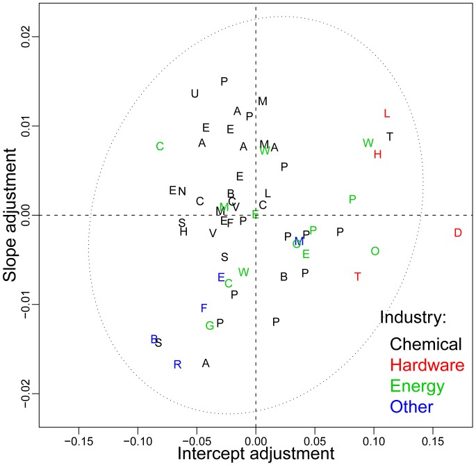
Figure 5. An illustration of how individual datasets deviate from the pooled data.
The data-specific contribution to the slope,  , is plotted against the data specific contribution to the intercept,
  , and compared to the ellipse of two standard deviation errors. The best forecasts are obtained for those found in the lower left quadrant, such as Beer, Sodium, RefinedCaneSugar, and Aluminum.

