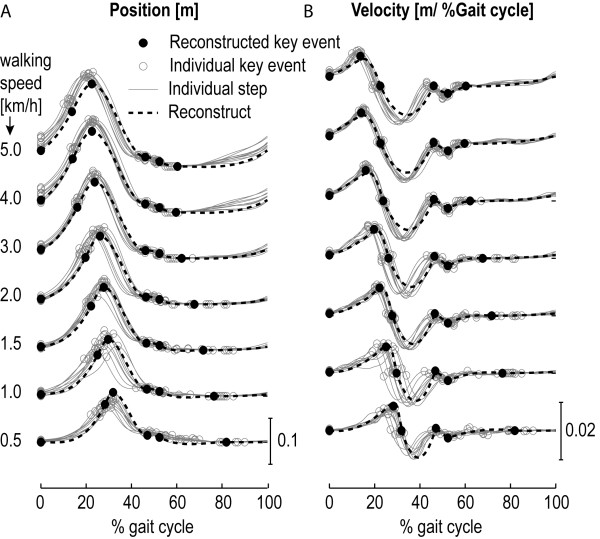
Figure 5.
Typical example of the reconstructed ankle-height patterns. Graph A shows the individual steps (gray lines), together with the detected key events (gray circles), at different walking speeds, for a specific subject. The black filled circles represent the predicted key events for this particular subject, based on the obtained regression models. The black line represents the spline, which is fitted through the predicted key events. Graph B shows the velocity profile.

