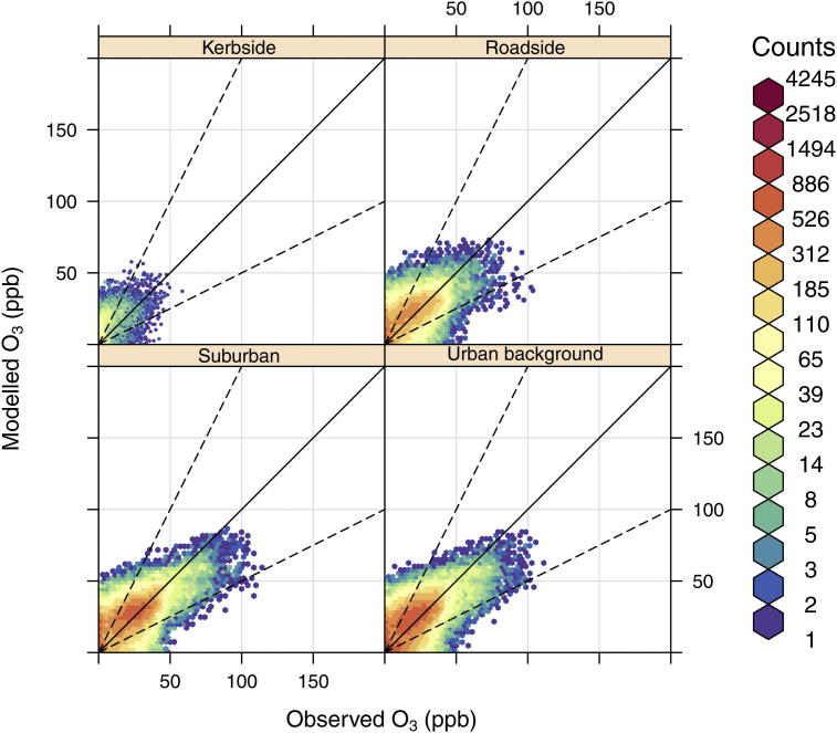
Fig. 4.
Scatter plots of observed and modelled O3 concentrations (ppb), at kerbside, roadside, urban background and suburban sites in 2006. The colour scale gives the hourly frequency within each scatter plot to allow clearer interpretation of the results. The black line represents the 1:1 relationship and the dashed lines the 1:2 and 1:0.5 relationships. (For interpretation of the references to colour in this figure legend, the reader is referred to the web version of this article.)

