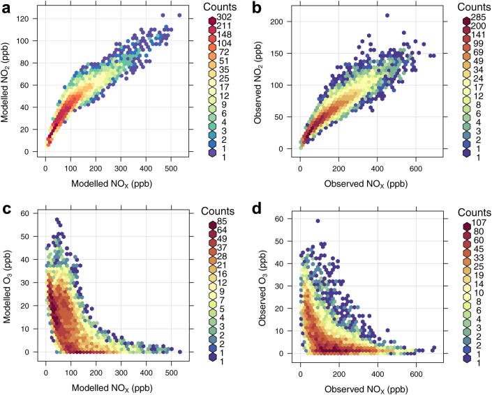
Fig. 9.
Scatter plots of hourly observed and modelled NOX vs. NO2 and NOX vs. O3 (ppb) at the Marylebone Road kerbside site in 2006. The colour scale gives the hourly frequency within each scatter plot to allow clearer interpretation of the results. (For interpretation of the references to colour in this figure legend, the reader is referred to the web version of this article.)

