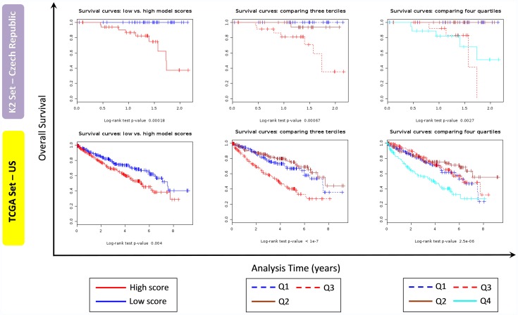
Figure 6. Survival curves for K2 and TCGA series.
Survival curves for K2 series (gene expression microarray data, upper panel) and TCGA series (RNA-seq data, bottom panel) using SignS software splitting scores in two groups (first column), three groups (second column) and quartiles (third column). Note: different scale for analysis time axis was used for K2 and TCGA series.

