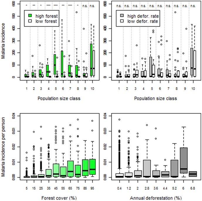
Figure 1. Malaria incidence is higher in areas with more forest cover whereas no clear pattern arises regarding deforestation rates.
Upper panels: Data were stratified into 10 percentile population size classes and average number of malaria cases per month for each year and city was depicted. Within each size class, we compare cities with high (green box-plots) vs. low forest cover (white box-plots) (upper left panel); and cities with high (grey box-plots ) vs. low deforestation rate (white box-plots) (upper right panel). Cities with high forest cover (or high deforestation rates) are cities that have forest cover (or deforestation rate) higher than the median for that size class. ‘n.s’, ‘*’, ‘**’, and ‘***’ are non-significant (p>0.05), significant (0.01<p<0.05), very significant (0.001<p<0.01) and highly significant (p<0.001) difference in means, respectively, based on permutation tests. Lower panels: Mean number of malaria cases per month for each year and city divided by total population as a function of forest cover (lower left panel) and deforestation rate (lower right panel). Note: y-axes were truncated to enable a clearer depiction of the bulk of the data (i.e., less than 0.5% observations were excluded from these plots).

