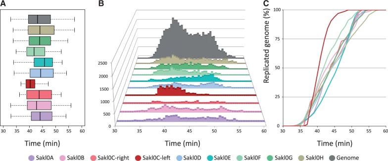
Fig. 2.—
Distribution of Trepavg values by chromosome (considering separately the left and right arms of chromosome Sakl0C). The same color code applies for the three subparts. (A) Box plot representation of the distribution of Trepavg values chromosome by chromosome. The span of the box represents the interquartile range (50% of the data between the first and the third quartiles). The black bar within the box represents the median of the distribution and the whiskers show the span of data corresponding to 1.5 times the IQR. (B) Distribution of Trepavg by chromosome and for the all genome. The y axis represents the number of probes that replicate at a given Trepavg. (C) Replication kinetics showing the proportion of replicated chromosome as a function of time during S-phase. The y axis represents the cumulated number of Trepavg values normalized at 100% for each chromosome.

