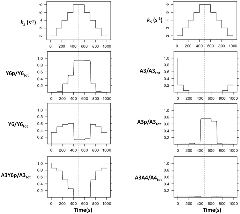
Figure 3. Time-course analyses.
The model is simulated with increasing and decreasing signal levels (k5) in course of time. k5 is increased from 2 to 6 and decreased in similar fashion at indicated time points (top most, left panel), and changes in each species were measured (as indicated on each panel). The dotted line represents the highest signal level, with equal signal steps on each side of it. The noted asymmetry around this line shows the presence of hysteresis in the system. The x- and y-axis represent time and species concentration respectively, where the latter is normalized by the appropriate total protein levels.

