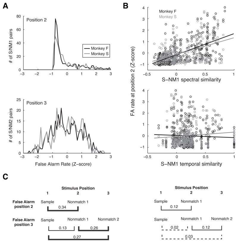
Figure 7.
(A) Distribution of FA rate across all possible sample/nonmatch pairs at stimulus positions 2 and 3 (upper and lower panels, respectively). FA rate is plotted as a Z-score normalized to SDs relative to the mean FA rate across all stimuli at that position for monkeys F and S (black and gray curves, respectively). The skewed shape and long tail at stimulus position 2 reflects the finding that a few sound pairs elicited FAs frequently, but most sound pairs did not (same data as Fig. 4B; see section 3.2.2 for discussion of frequently-confused sound pairs). (B) Scatter plots of FA rate at stimulus position 2 as a function of the spectral similarity (upper panel) and temporal similarity (lower panel) between all possible sample/nonmatch pairs. Slopes of fits from linear regression for spectral similarity are 1.9 and 1.5 for monkey F (in black) and S (in gray), respectively; and for temporal similarity they are −0.2 and 0.3 for monkeys F and S, respectively. (For illustration, regression was performed individually for each predictor; these slopes are slightly different from the beta values in Table 1, which were derived from multiple linear regression using both predictors; see Methods for computation of spectral and temporal similarity.) (C) R2 values from multiple linear regression of FA rate and stimulus similarity for monkeys F and S (left and right panels, respectively). Each bracket links the pair of stimulus positions for which FA rate was regressed against both spectral and temporal similarity; line weight represents the percent of the variance accounted for by the regression model (brackets in bold, > 25%, significant; thin brackets, < 25%, significant; dashed brackets, nonsignificant).

